Presenting Data with Charts (Excel)
This worksheet marks itself
Set it as homework or classwork and every answer is marked as pupils go, with feedback on what they got wrong. The scores go straight into your mark book, so you can see who needs help before the next lesson.
- 13 questions
- 35 marks
- about 35 minutes
- marked instantly
Question types: short answer, multi-part, multiple choice, calculation, fill the gap.
Try one from this worksheet
Which chart type is designed to show how a value changes over time, such as temperature recorded every hour?
Pick an answer: it's marked straight away, just as your pupils would see it.
About this resource
Data Detective (Excel track), Lesson 5 — choosing the right chart type (bar, line or pie) for a set of data, and reading a chart accurately, using a class snack-vote survey (58 votes) as the real-world context. Students work in real Microsoft Excel / Google Sheets on a downloadable starter file,…
18 slides.
Lesson outline
- Hook — 58 Votes, One Survey
- Open the Real File
- Do Now — Retrieval
- Keywords for This Lesson
- The Snack Survey
- Bar Chart — and Why a Line Chart Would Be Wrong Here
- Hinge Check — Bar or Line?
- Choosing the Right Chart
- Practice 1 (guided) — Sort the Scenarios
- Reading the Chart Together
- Hinge Check — Which Chart Shows the Share?
- Practice 2 (guided) — Summarise Before You Chart
More from Data Detective (Excel)
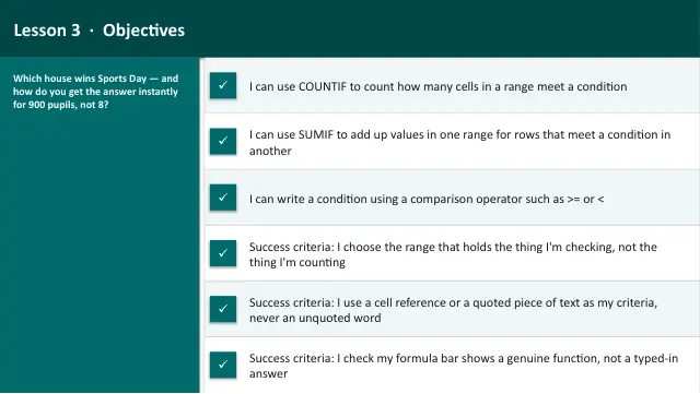
- Lesson packAsking Questions of Data: COUNTIF & SUMIF (Excel)Subscription
- Lesson packData Investigation Capstone: The Party Budget (Excel)Subscription
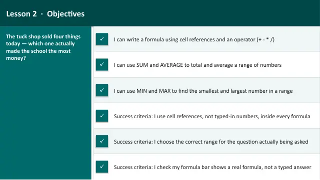
- Lesson packFormulas and Functions: SUM, AVERAGE, MIN & MAX (Excel)Subscription
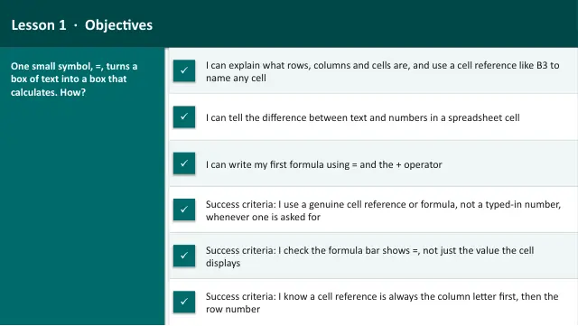
- Lesson packIntroduction to Spreadsheets (Excel)Subscription
- Lesson packLogic in a Spreadsheet: IF, Then Nested IF (Excel)Subscription
- Knowledge organiserData Detective (Excel)Subscription
- Scheme of workData Detective (Excel)Subscription