Map projections: why does Greenland look so big?
KS3 GeographyL4KS3Lesson packSubscription
Also online
This worksheet marks itself
Set it as homework or classwork and every answer is marked as pupils go, with feedback on what they got wrong. The scores go straight into your mark book, so you can see who needs help before the next lesson.
- 11 questions
- 29 marks
- about 30 minutes
- marked instantly
Question types: multiple choice, true or false, matching, label the diagram, sorting.
Try one from this worksheet
Identify what a map projection is.
Pick an answer: it's marked straight away, just as your pupils would see it.
About this resource
Pupils compare how the Mercator and Equal Earth projections show the size of Greenland and Africa, and explain why every flat map of a round Earth distorts something.
15 slides.
Lesson outline
- Hook
- Do Now — Retrieval
- Keywords for This Lesson
- Teach — why every flat map distorts a round Earth
- Comparing Two Projections
- I Do
- Poll
- Discuss — think-pair-share: "Why might a shipping company prefer the Mercator projection?"
- Task — guided: match three projections to three purposes
- Task — semi: identify which countries are distorted most on a Mercator map, with reasons
- Task — independent: explain in two sentences why Greenland looks bigger than it is; extension: suggest a better projection for a world population map
- Self-Check
Unit bundleMaps, place and scale
More from Maps, place and scale
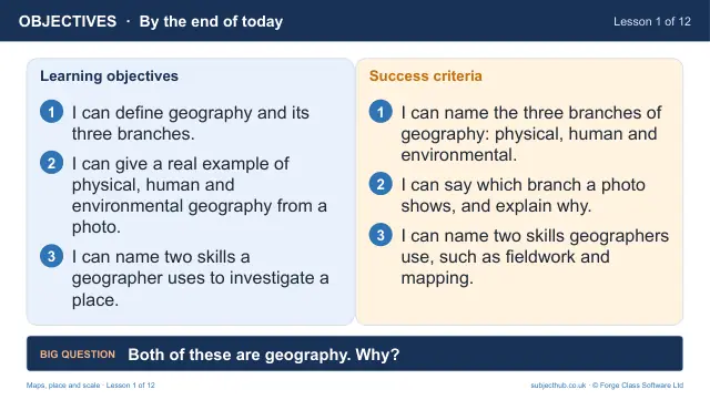
- Lesson pack · L1What is geography? Physical, human and environmentalFree
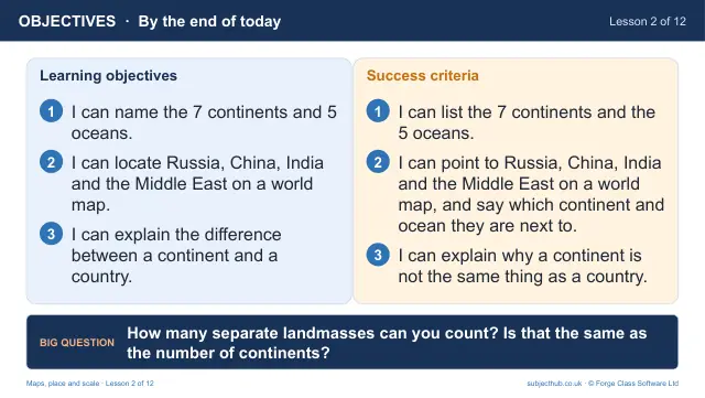
- Lesson pack · L2Continents, oceans and the world mapSubscription
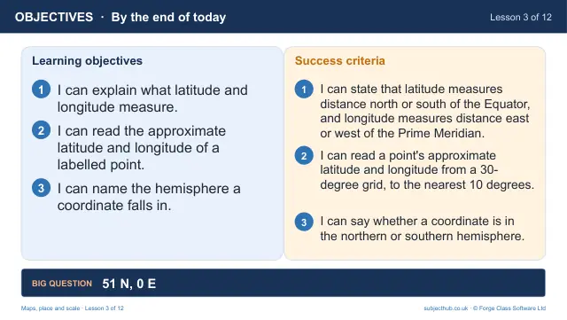
- Lesson pack · L3Latitude and longitude: finding any place on EarthSubscription
- Lesson pack · L5The UK and the British Isles: an atlas investigationSubscription
- Lesson pack · L6Direction and map symbols: reading an OS mapSubscription
- Lesson pack · L7Four-figure grid referencesSubscription
- Lesson pack · L8Six-figure grid referencesSubscription
- Lesson pack · L9Scale and distanceSubscription